Visuals

Bullet Chart

Also called: Bullet graph, Bullet bar

A bullet chart is a compact bar that shows one measure against a target marker, on top of shaded bands for poor, fair and good. It's a space-saving alternative to a gauge.
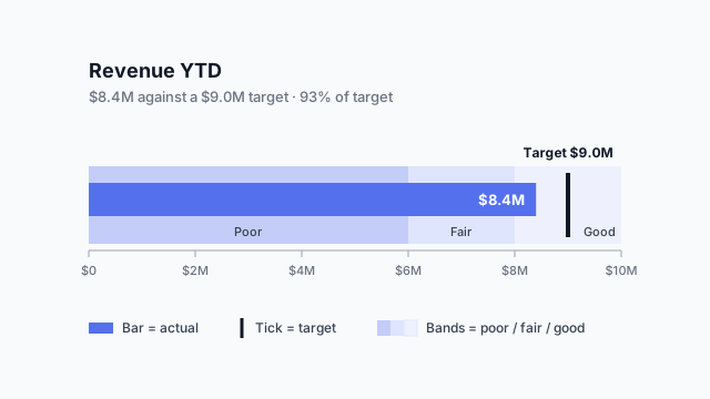
Bullet chart of revenue YTD: a dark bar at $8.4M, a target tick at $9.0M, and poor, fair and good bands behind it on a $0–10M scale.

What a bullet chart shows

A bullet chart packs three layers into one thin bar:

  1. The featured measure. A dark bar for the actual value, here $8.4M revenue YTD.
  2. The comparative measure. A short vertical tick for the target, here $9.0M. The gap between the end of the bar and the tick is the story.
  3. The qualitative ranges. Two to three background bands, darkest for “poor” and lightest for “good”, so readers can judge the value without knowing the thresholds by heart.

Read left to right, the example says: revenue is $0.6M short of target (93%), but still inside the “good” range. Without the bands, 93% could look like a miss. With them, it reads as a near miss on a stretch goal.

Bullet chart vs. gauge

Bullet charts were designed as a replacement for gauges, and the difference is mostly space. A gauge spends a whole panel on one number. The same panel holds four bullet charts, and because they share an axis, they’re easy to compare.
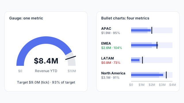
The same space holding one gauge for total revenue, or four bullet charts for revenue by region: APAC 95%, EMEA 104%, LATAM 73% and North America 91% of target

In the stacked version, LATAM’s short bar sitting well left of its tick stands out at once. With four gauges side by side, readers would have to compare needle angles.

Common uses

  • Actual vs. target by team, region or product. The most common use: one row per group, sorted by % of target or by size.
  • KPI tables. A column of bullets next to each metric turns a list of numbers into a scorecard.
  • Budget consumption. Spend so far against budget, with bands marking comfortable, tight and over.

In Power BI vs. Tableau

Power BITableau
Built-in visualNone. Use a custom visual from AppSource, or a bar chart with a target lineBullet graph in Show Me
TargetA second measure (e.g. Revenue Target)Reference line, usually from a target measure
BandsSet in the custom visual’s format optionsReference distributions (e.g. 60% / 80% of target)

Best practices

  • Keep bands subtle. Light tints or greys for the ranges, one strong colour for the bar. If the bands shout, the bar gets lost.
  • Use two or three bands, no more. Five shades of the same colour are hard to tell apart.
  • Share one scale when you stack them. If each row has its own axis, readers compare lengths that don’t mean the same thing.
  • Label the value and the target. A tick without a number makes people guess.

Mocking up a bullet chart

Stakeholders rarely ask for bullet charts by name, but they often ask for “a gauge for each region.” Showing both options on a mockup usually ends with the bullets, before anyone has picked a custom visual.

Related terms

Common questions

Who invented the bullet chart?
Stephen Few designed the bullet graph in the mid-2000s as a replacement for dashboard gauges and meters. The goal was to show the same information (value, target and performance ranges) in far less space.
Does Power BI have a bullet chart?
Not as a built-in visual. Power BI users add one from the custom visuals in AppSource, or approximate it with a bar chart plus a target line. Tableau offers a bullet graph in Show Me, and Looker Studio has a bullet chart type.
When should I use a bullet chart instead of a gauge?
Almost whenever you'd use a gauge. A bullet chart shows the same value, target and ranges, but it's a thin bar, so several of them stack into a list that's easy to compare. A gauge only really works for one hero metric.

Mock it up before you build it

Lay out your Power BI or Tableau dashboard in Mockko, get sign-off, then build. Free to start.

Try Mockko free