What a KPI dashboard shows
A KPI dashboard is organised around targets, not data sources. Each tile answers the same three questions: what’s the number, what should it be, and how far off are we?
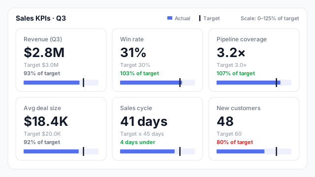
In the example, a sales team’s Q3 page shows six KPIs. Win rate and pipeline coverage are ahead of target. Revenue and average deal size are slightly behind, at 93% and 92%. New customers is the clear problem, at 48 against a target of 60 (80%). Sales cycle is a “lower is better” metric, so 41 days against a 45-day ceiling is good news, and it’s coloured green.
Each tile uses a small bar with a target tick, a mini bullet chart, so the gap to target is visible without reading the percentage.
Common KPI dashboards
Most teams build one. The most common, and the KPIs they usually track:
| Team | Typical KPIs |
|---|
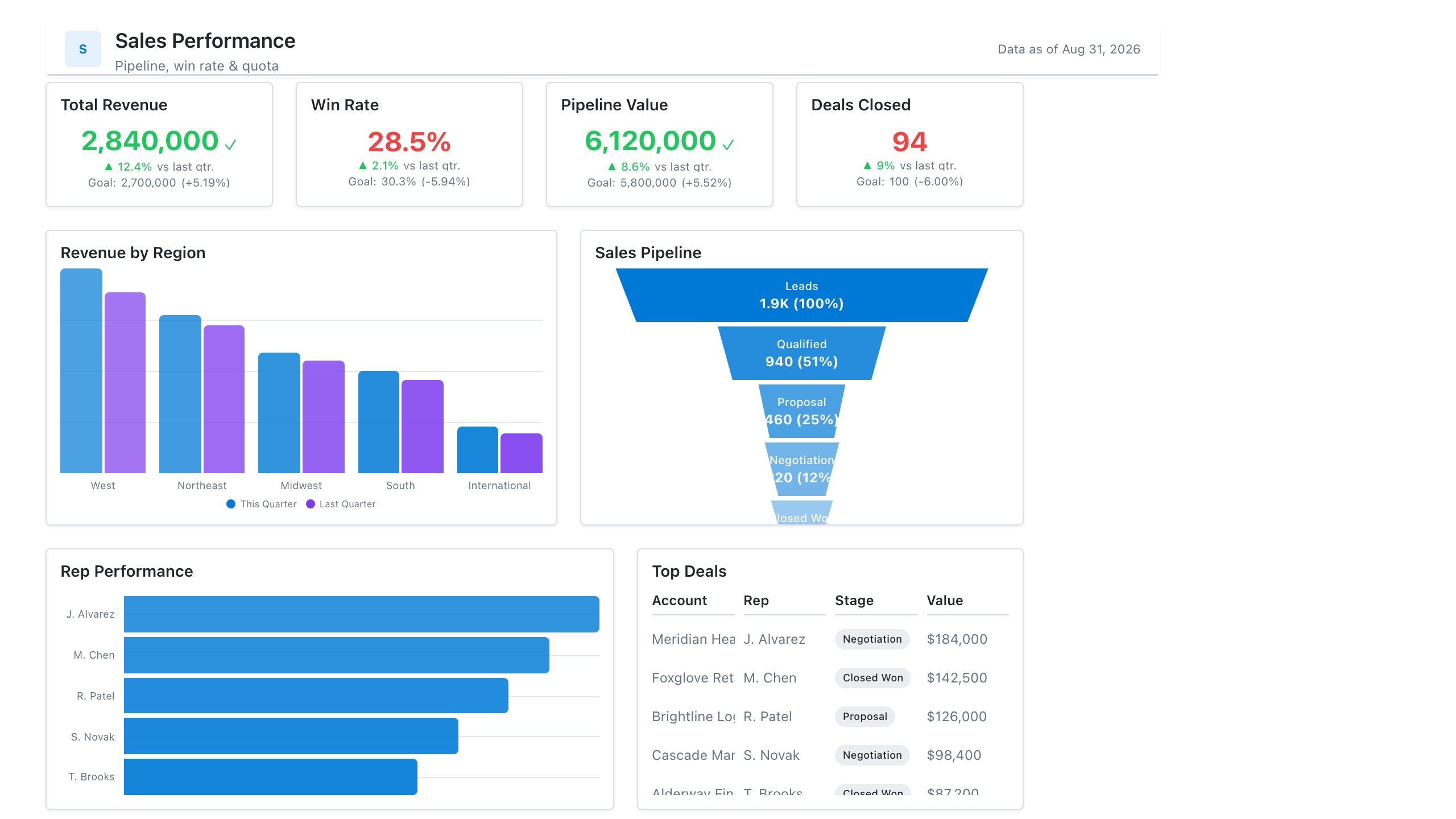
| Sales | Revenue vs. target, win rate, pipeline coverage, average deal size, sales cycle length |
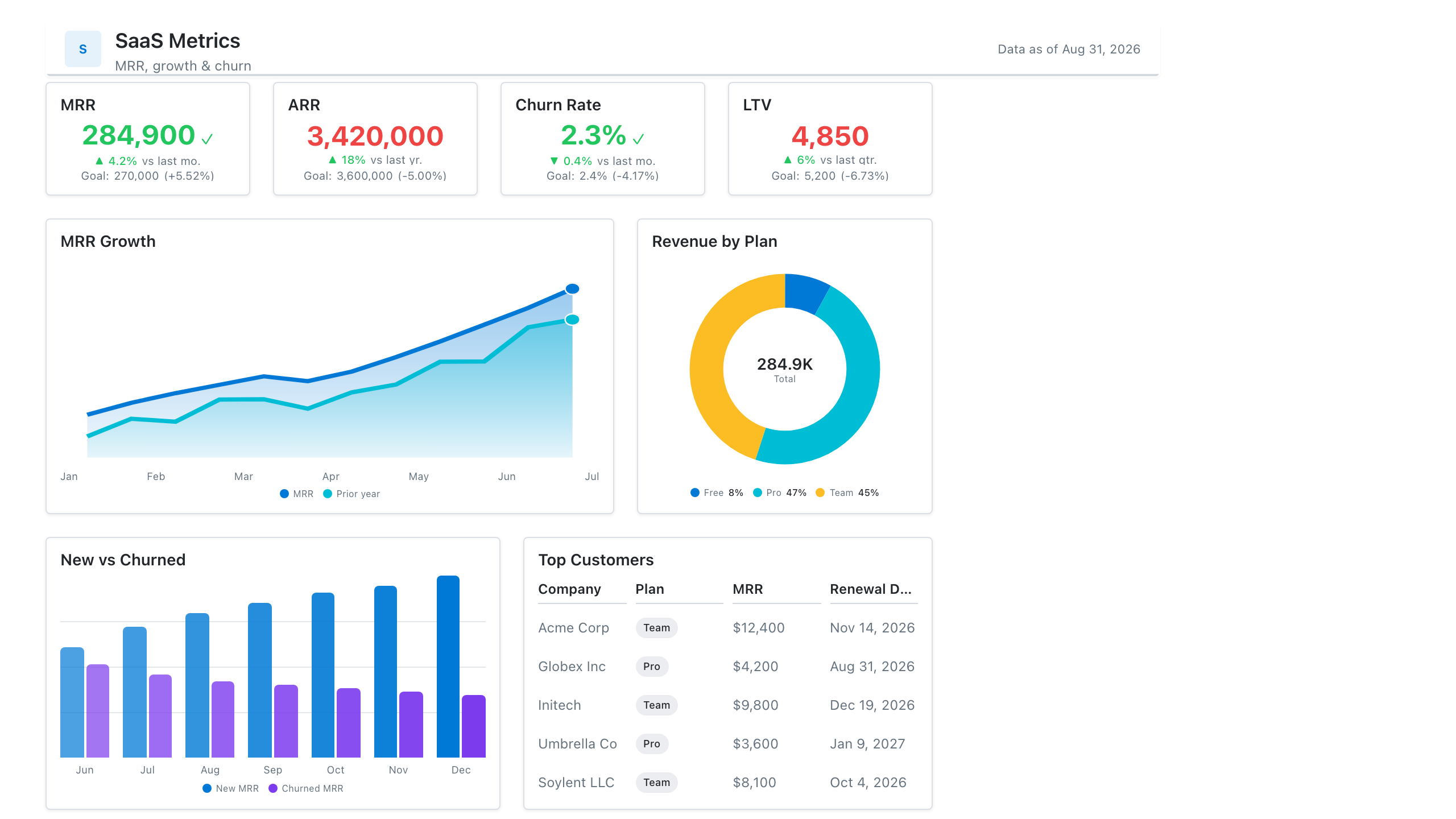
| SaaS / subscription | MRR or ARR, net revenue retention, churn, customer acquisition cost, CAC payback |
| Marketing | Leads, cost per lead, conversion rate by stage, marketing-sourced pipeline |
| Operations | On-time delivery, capacity utilisation, backlog, defect or error rate |
| Customer support | First response time, resolution time, CSAT, ticket backlog |
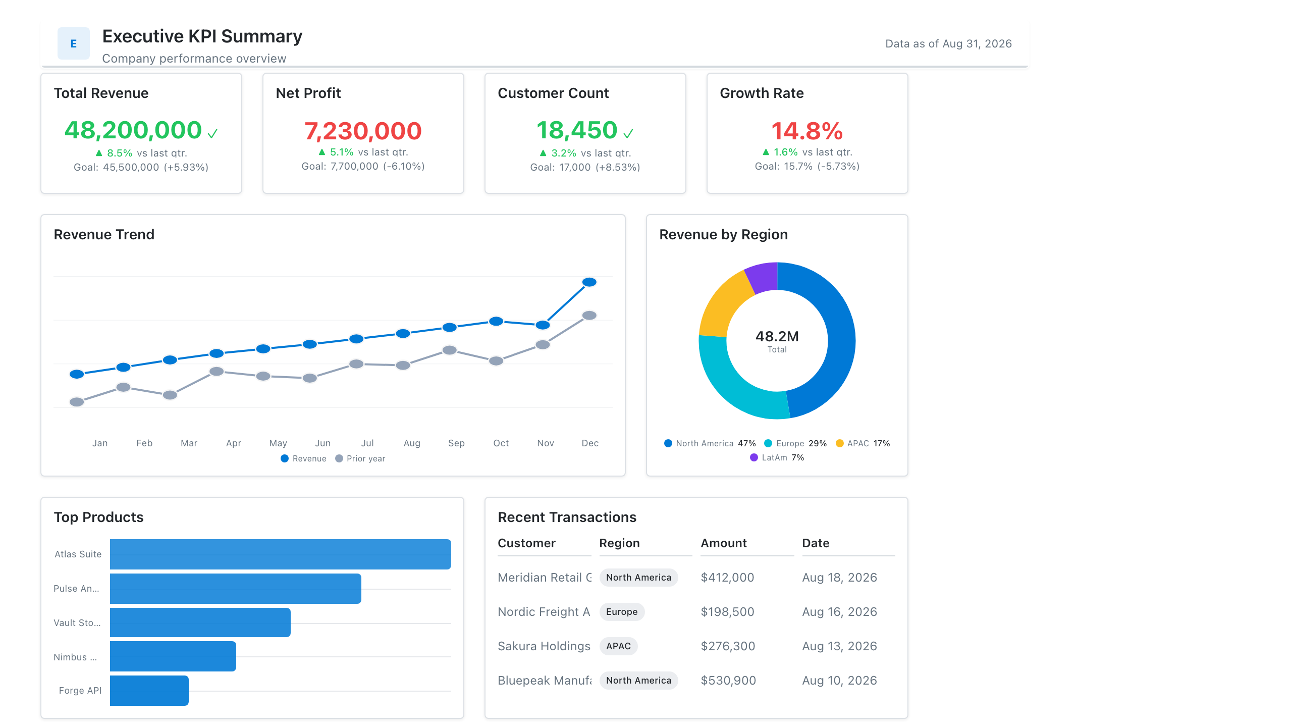
Leadership’s version, covering the whole business, is the executive dashboard.
Anatomy of a KPI tile
Whatever the visual, each KPI needs:
- A clear label with a time frame. “Revenue (Q3)”, not “Revenue”.
- The current value, large and rounded.
- The target, stated as a number, so nobody has to remember it.
- A status. Percent of target, a variance, or a colour. Make sure the colour logic handles “lower is better” metrics like cost, churn and cycle time.
- Optionally, a trend. A sparkline shows whether a metric that’s on target today is heading the wrong way.
The simplest version is a row of KPI cards. Dashboards with more metrics often switch to a table of KPIs with a bullet chart or sparkline column.
Best practices
- Every KPI needs an owner and a target. If nobody can say what “good” looks like, it’s a metric, not a KPI, and it belongs on a detail page.
- Order by importance. The KPI the team is judged on first goes top left.
- Use the same tile layout throughout. When every tile puts value, target and status in the same place, readers scan instead of read.
- Colour sparingly. Reserve red for what needs action. If half the page is red, nothing is.
Mocking up a KPI dashboard
Choosing the KPIs and agreeing their targets is most of the work, and it’s a conversation rather than a build task, so sketch the tiles on a mockup first. Our dashboard wireframe best practices show how to lay them out.