KPI Card
Also called: Card visual, Scorecard, Big number (BAN)
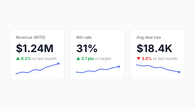
A KPI card is a dashboard visual that shows one headline metric as a large number, usually with a comparison to target or a prior period and a small trend indicator.
Also called: Card visual, Scorecard, Big number (BAN)
A KPI card is a dashboard visual that shows one headline metric as a large number, usually with a comparison to target or a prior period and a small trend indicator.
A good KPI card answers three questions at a glance:
The label should name the metric and the time frame. “Revenue” is ambiguous, while “Revenue (MTD)” isn’t.
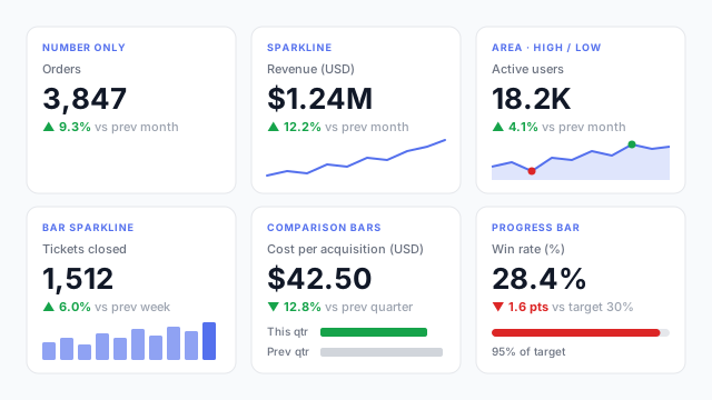
The small visual under the number changes what the card says. These are the six styles you can build in Mockko:
| Style | Best for |
|---|---|
| Number only | Tight rows where the delta says enough |
| Sparkline | Showing the trend behind the number |
| Area + high / low | Volatile metrics where the range matters |
| Bar sparkline | Counts per period (weekly tickets, daily orders) |
| Comparison bars | This period vs. last, side by side |
| Progress bar | Progress toward a target or quota |
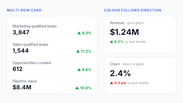
When several related numbers don’t each deserve their own card, a multi-row card stacks them, each with its own change. And whatever the style, colour should follow direction: for revenue, up is green, but for churn or cost, up is red.
KPI cards almost always sit in a single row across the top of the page. That’s where readers look first, so the cards act as the summary and the charts below explain them. Order them by importance from left to right, and keep them the same size so none looks more important by accident.
| Power BI | Tableau | |
|---|---|---|
| Built-in visual | Card, Multi-row card, and the newer Card (new) with reference labels | No dedicated card, so you build one from a text worksheet showing a single measure |
| Comparison / target | KPI visual, or reference labels on the new card | Calculated field for the delta, shown as a second line of text |
Settle the row of cards first. Which metrics make the cut is usually the hardest conversation with stakeholders, and it’s much cheaper to have that conversation on a mockup than after the measures are built.
These free Mockko templates use it. Open one and edit it in your browser.
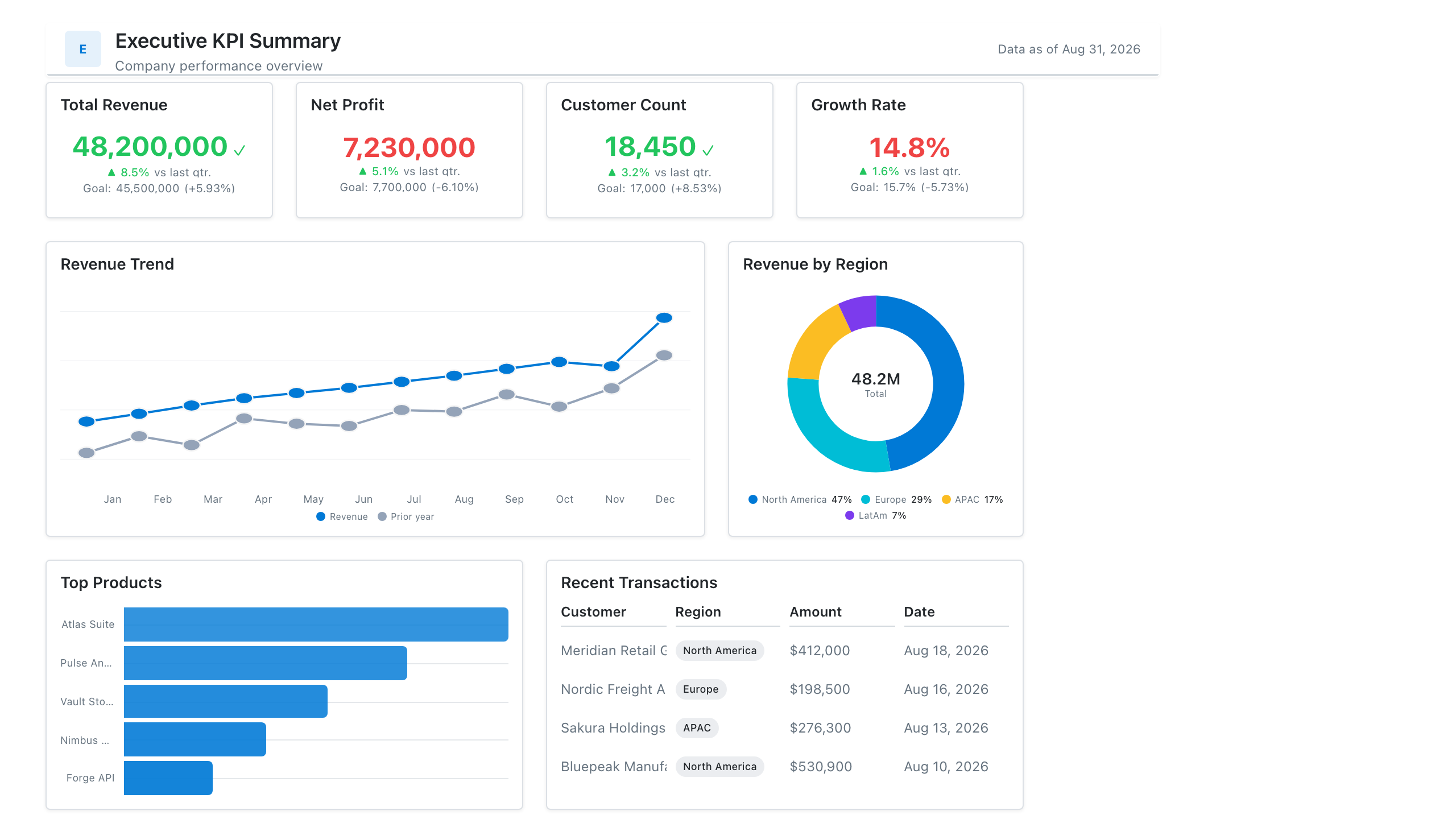
Single-page executive view of the metrics leadership cares about — built for the first client meeting.
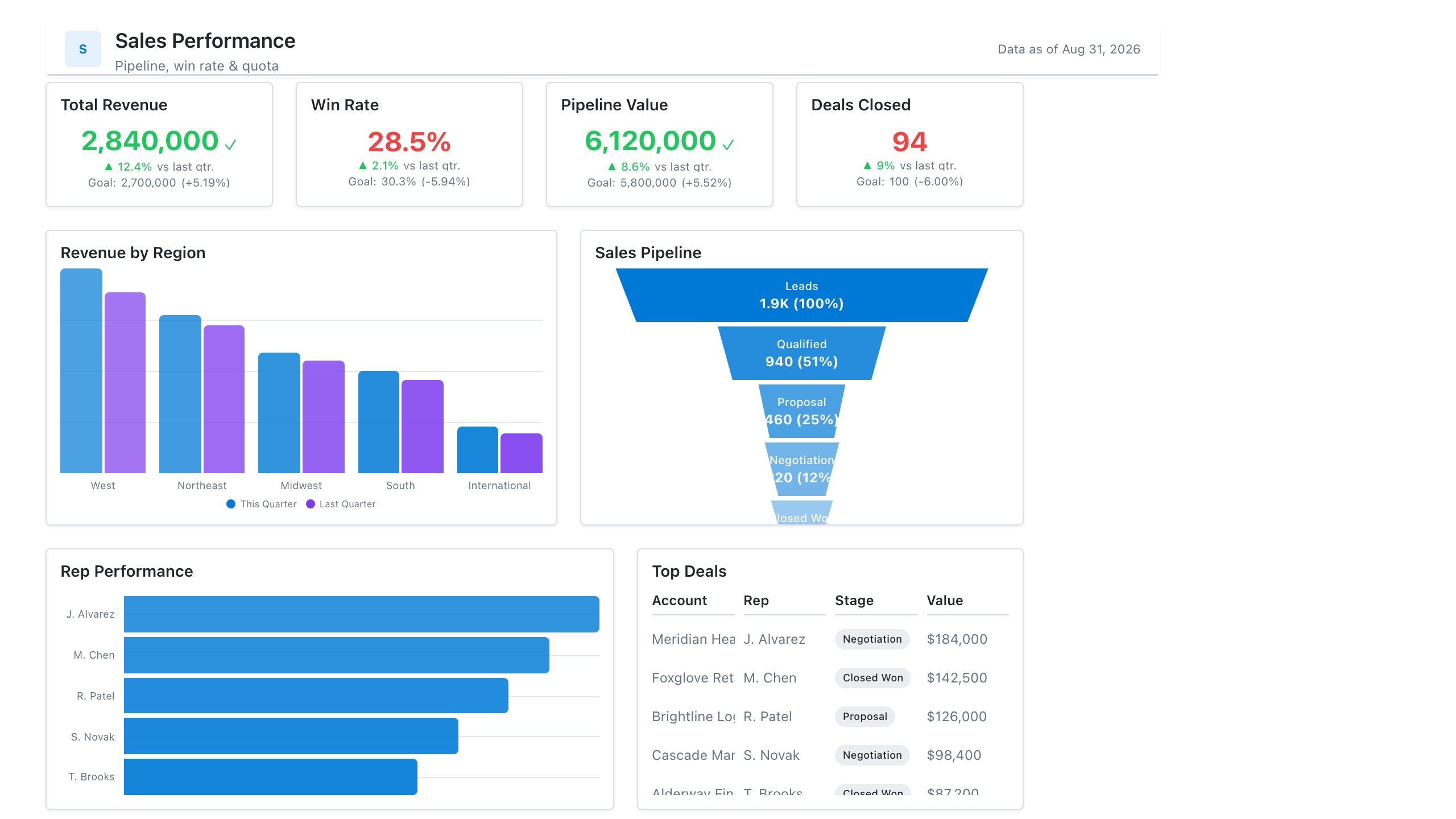
Revenue, win rate, pipeline value, and rep performance across regions — the layout most sales teams build first.
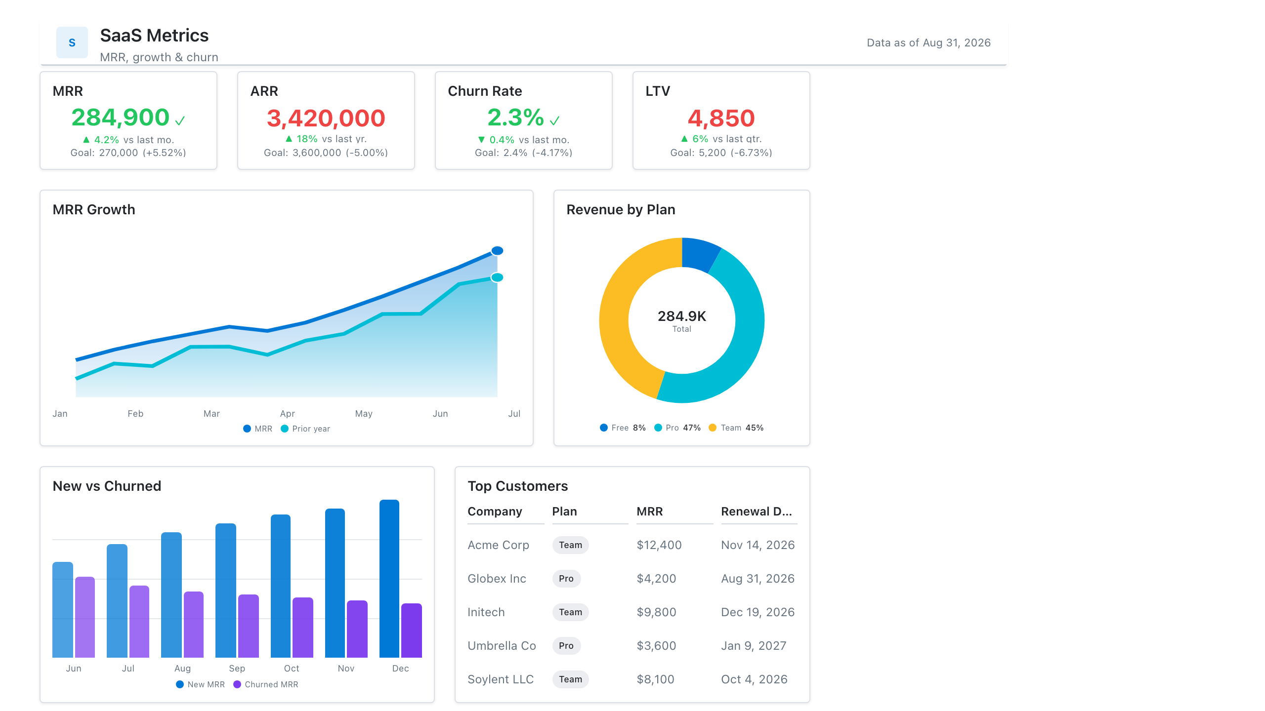
MRR, net revenue retention, churn, and activation in one subscription-metrics wireframe — the layout most SaaS teams review weekly.
Lay out your Power BI or Tableau dashboard in Mockko, get sign-off, then build. Free to start.
Try Mockko free