Gauge Chart
Also called: Speedometer chart, Dial chart
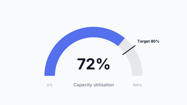
A gauge chart shows a single value on a semicircular scale from a minimum to a maximum, usually with a marker for the target, like a speedometer.
Also called: Speedometer chart, Dial chart
A gauge chart shows a single value on a semicircular scale from a minimum to a maximum, usually with a marker for the target, like a speedometer.
A gauge has four parts:
Some gauges add coloured bands (red / amber / green) to show zones. Use them only if the thresholds are agreed, otherwise the colours mislead.
Gauges take up a lot of space for one number, so use them sparingly. One or two per page, usually in the top row next to KPI cards, for the metrics that are about hitting a target. A row of six gauges is hard to compare. Use a bar chart with target lines instead.
Gauges often get asked for by name (“can we have a speedometer?”). Put one in the mockup next to a KPI card showing the same metric, and let stakeholders pick. It usually settles the debate quickly.
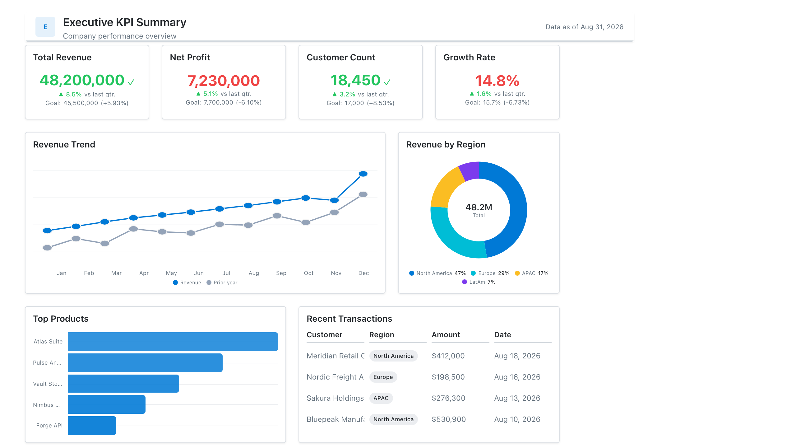
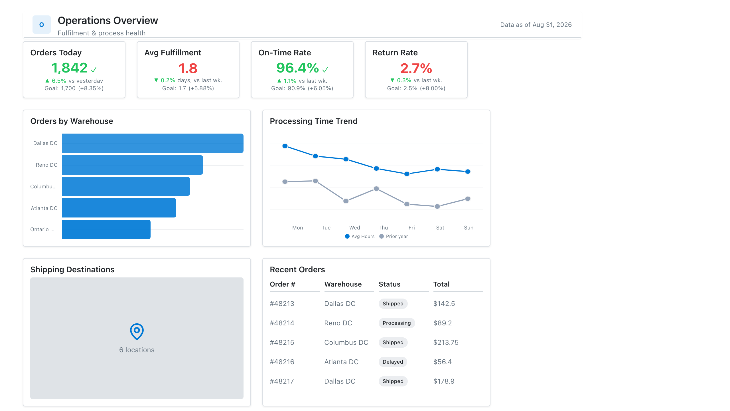
These free Mockko templates use it. Open one and edit it in your browser.
Lay out your Power BI or Tableau dashboard in Mockko, get sign-off, then build. Free to start.
Try Mockko free