Visuals

Sparkline

Also called: Micro chart, Inline trend

A sparkline is a tiny line chart with no axes or labels, drawn next to a number or inside a table cell to show its recent trend at a glance.
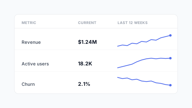
A table of three metrics, Revenue, Active users and Churn, each with its current value and a small sparkline showing the last 12 weeks.

What a sparkline is for

A sparkline answers one question: which way is this going? It gives up exact values, axes and gridlines to fit in the space of a word. Readers get the shape of the trend (rising, falling, flat, spiky) without leaving the number they’re reading.

The last point is often marked with a dot so the eye lands on “now”.

Types of sparkline

Same 12 weeks of data, four ways to draw it. Pick the one that matches the data, not the one that looks nicest.
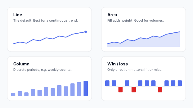
Four sparkline types for the same data: line, area, column, and win/loss

  • Line: the default, for anything continuous like revenue, users or response time.
  • Area: a line with the fill underneath. It adds visual weight, so it suits volumes.
  • Column: one bar per period, for counts that reset each period (tickets per week).
  • Win / loss: only up or down, for hit/miss against a target.

Reading a sparkline

Sparklines are often marked with a few reference points: the start, the current value, and the high and low. A shaded normal range behind the line shows at a glance whether “now” is unusual.
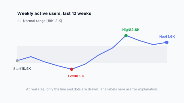
Enlarged sparkline of weekly active users with start, low, high and current values marked over a shaded normal range

Where sparklines go on a dashboard

  • Inside KPI cards, under the headline number.
  • In a table column, one per row, so you can scan the trends down a list of products, regions or reps.
  • Next to a metric name in a text-heavy summary.

Best practices

  • Keep the time window the same across every sparkline on the page, otherwise the shapes can’t be compared.
  • Don’t add axes. If readers need values, it should be a proper line chart.
  • Watch the scale. Each sparkline usually has its own y-axis range, which makes small moves look big. Say so if that matters.

Mocking up sparklines

Sparklines are easy to forget in the plan and then hard to fit in later. Put them in the mockup’s KPI cards and tables from the start so the row heights and card sizes allow for them.

See it in a real layout

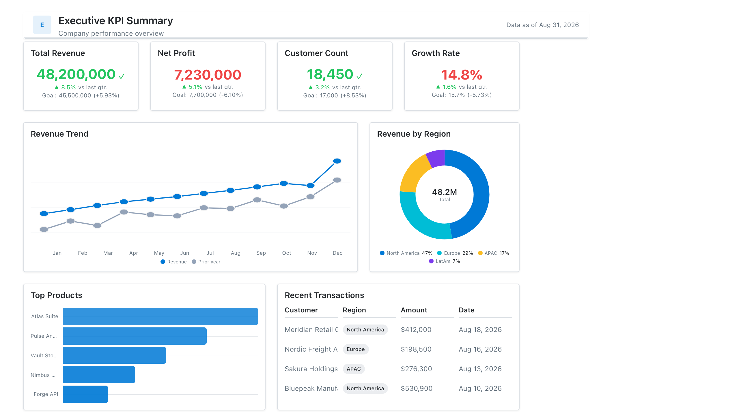
These free Mockko templates use it. Open one and edit it in your browser.

Related terms

Common questions

Who invented sparklines?
The term was coined by data visualisation writer Edward Tufte, who described them as "small, intense, simple, word-sized graphics."
Can you add sparklines in Power BI?
Yes. Power BI supports sparklines inside table and matrix visuals, added per measure. In Tableau you build them as a small line chart worksheet with the axes hidden.

Mock it up before you build it

Lay out your Power BI or Tableau dashboard in Mockko, get sign-off, then build. Free to start.

Try Mockko free