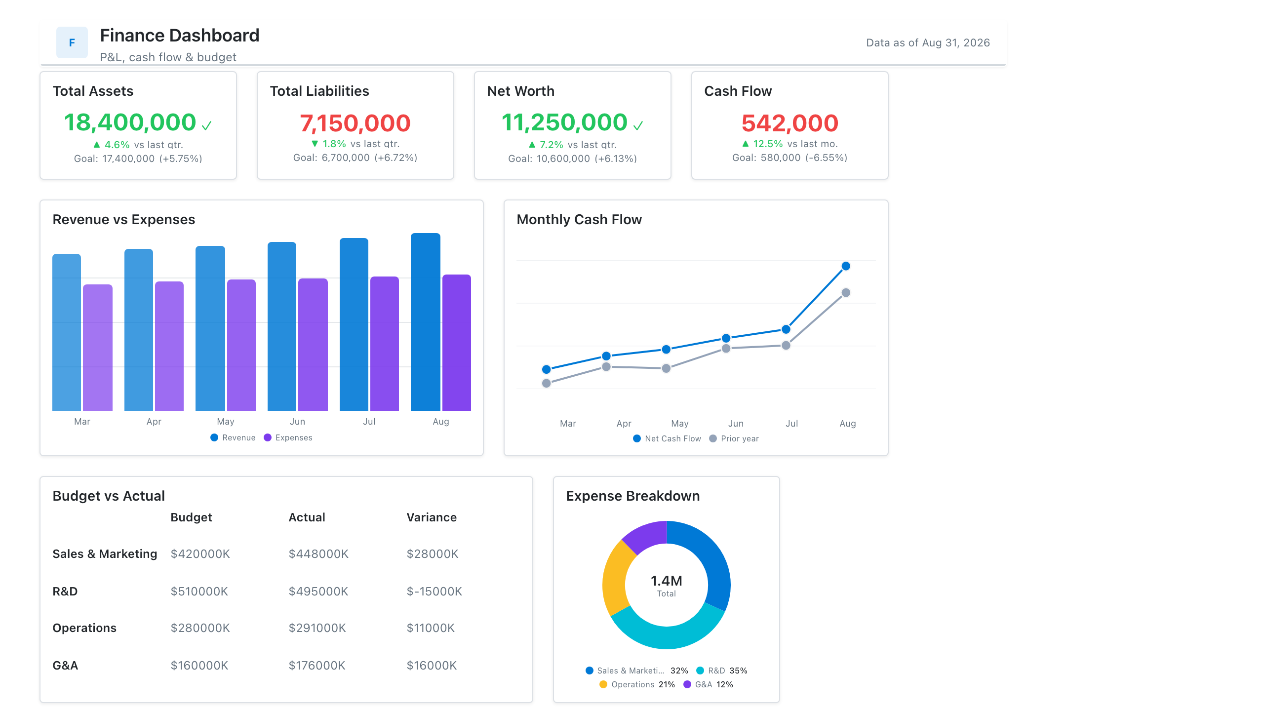
Matrix Visual
Also called: Pivot table, Crosstab, Text table (Tableau)
A matrix is a table that groups rows and columns by categories, such as region by quarter, with subtotals and expandable levels. It's the BI version of a pivot table.
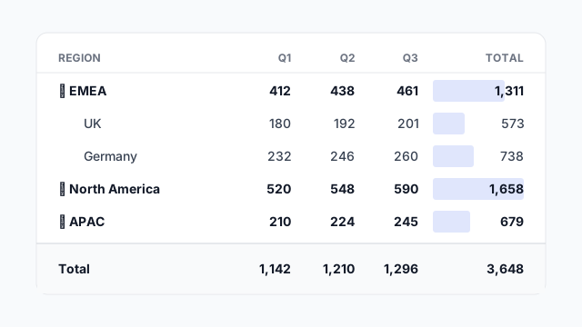
Also called: Pivot table, Crosstab, Text table (Tableau)
A matrix is a table that groups rows and columns by categories, such as region by quarter, with subtotals and expandable levels. It's the BI version of a pivot table.
A matrix answers “how does this measure break down across two dimensions?” Rows are one grouping (e.g. region → country), columns are another (e.g. quarter), and each cell holds the value where they meet. Subtotals and a grand total are calculated for you.
The expand / collapse arrows (▸ ▾) let viewers drill from region down to country without leaving the page.
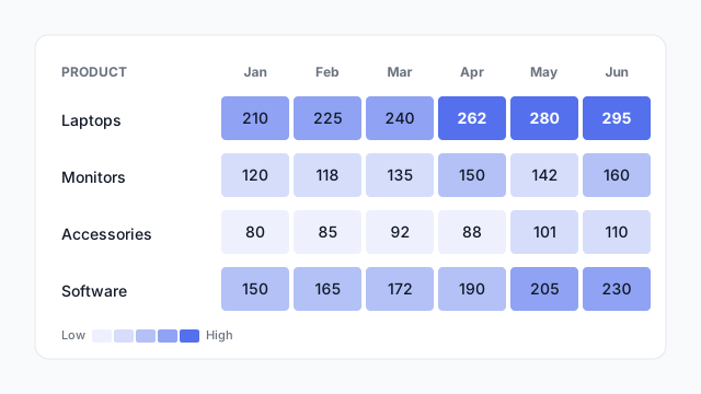
Conditional formatting shades each cell by value, so patterns jump out before anyone reads a number. Here, Laptops is clearly the strongest line and is growing every month.
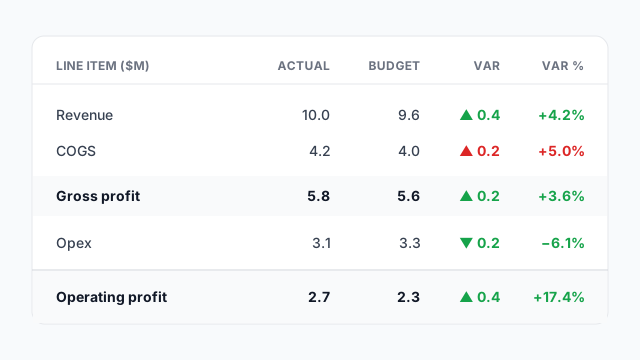
Actual vs. budget with a variance column, coloured by whether the gap is good or bad. Note that a cost going up is red even though the number is positive.
Matrices are dense, so they usually go at the bottom of the page, below the KPIs and charts. There they act as the “show me the detail” layer, for people who want exact numbers after the charts have told the story.
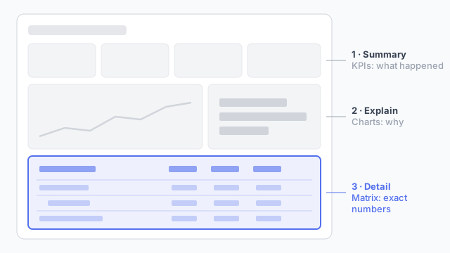
Read top to bottom, the page goes from what happened (KPIs), to why (charts), to the exact numbers (matrix).
Decide the row hierarchy and column grouping on the mockup, because it drives how the data model has to be shaped. Finding out late that finance wanted country → region rather than region → country is an expensive change.
These free Mockko templates use it. Open one and edit it in your browser.
Lay out your Power BI or Tableau dashboard in Mockko, get sign-off, then build. Free to start.
Try Mockko free