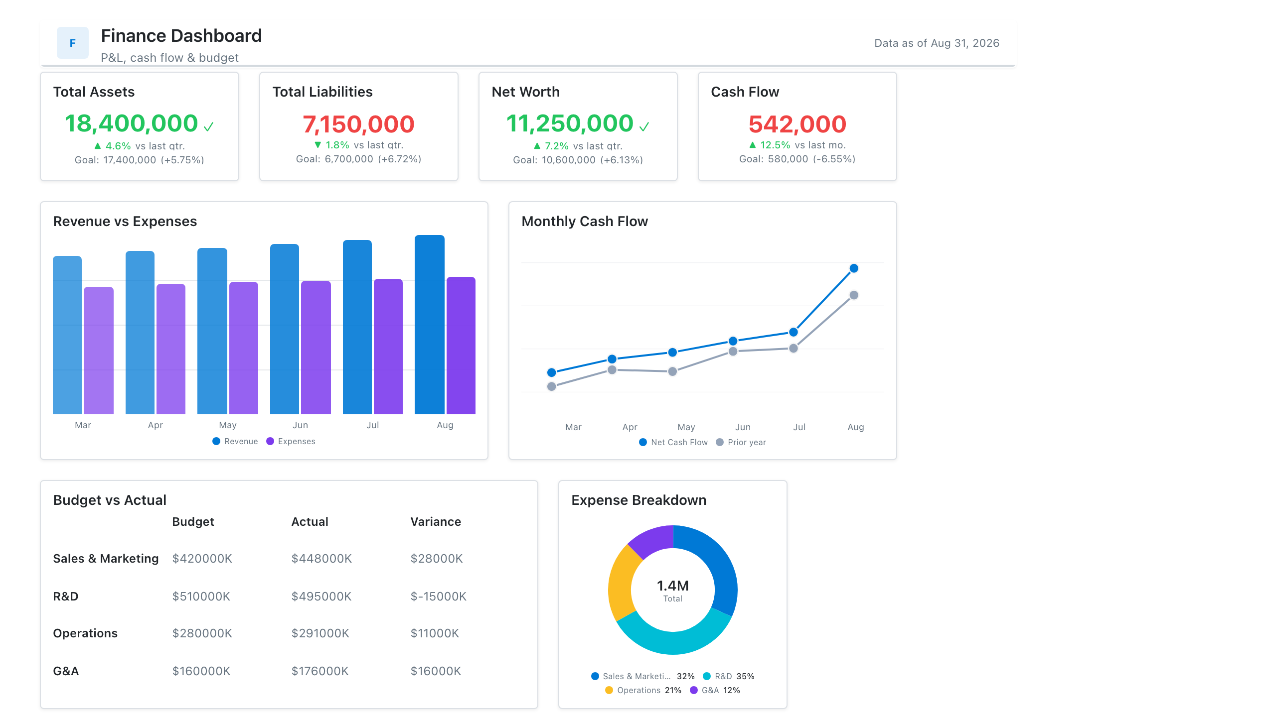
Waterfall Chart
Also called: Bridge chart, Walk chart, Cascade chart
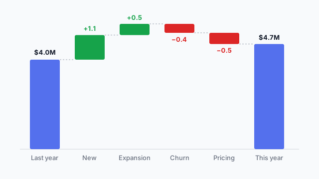
A waterfall chart shows how a starting value becomes an ending value through a series of positive and negative changes, with each change drawn as a floating bar.
Also called: Bridge chart, Walk chart, Cascade chart
A waterfall chart shows how a starting value becomes an ending value through a series of positive and negative changes, with each change drawn as a floating bar.
The first bar is the starting value (e.g. last year’s profit). Each bar after it floats up or down from where the previous one ended:
The result reads left to right like a sentence: “We started at $4.0M, gained $1.1M from new customers, lost $0.4M to churn, and ended at $4.7M.”
Ordered from most to least common.
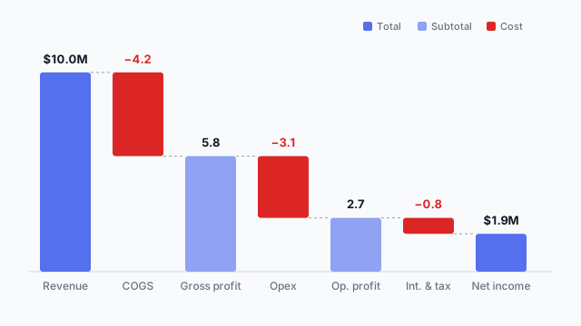
The classic finance waterfall. It starts with revenue, takes away each cost layer, and shows subtotals (gross profit, operating profit) as full bars along the way, so readers can see where the margin goes.
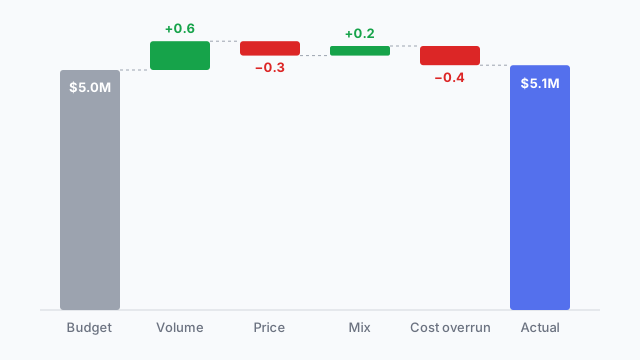
Starts at the budget, ends at the actual, and each bar in between is a driver of the gap (volume, price, mix, cost). It answers the question every monthly review asks: why did we miss (or beat) the plan?
Last year’s revenue or profit on the left, this year’s on the right, and the drivers of the change in between. It’s the chart at the top of this page.
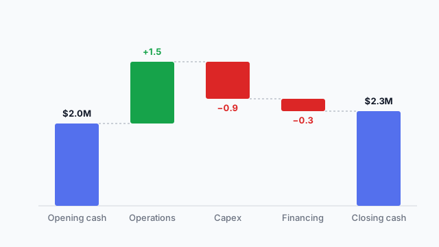
Opening cash to closing cash, via operating cash flow, capital spending and financing. Useful when profit and cash tell different stories.
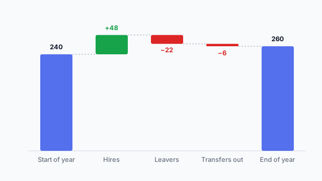
Starting headcount, plus hires, minus leavers and transfers, equals ending headcount. A favourite of HR dashboards because it shows why the total changed, not just that it did.
Finance stakeholders tend to have firm opinions about which steps appear and in what order. Agree that on a mockup first so the order is settled before anyone writes the DAX or calculated fields.
These free Mockko templates use it. Open one and edit it in your browser.
Lay out your Power BI or Tableau dashboard in Mockko, get sign-off, then build. Free to start.
Try Mockko free