Power BI

Slicer

Also called: Filter control, Quick filter (Tableau), Drop-down list control (Looker Studio)

A slicer is an on-canvas filter in a Power BI report that lets viewers narrow every visual on the page by picking values such as a date range, region, or product.

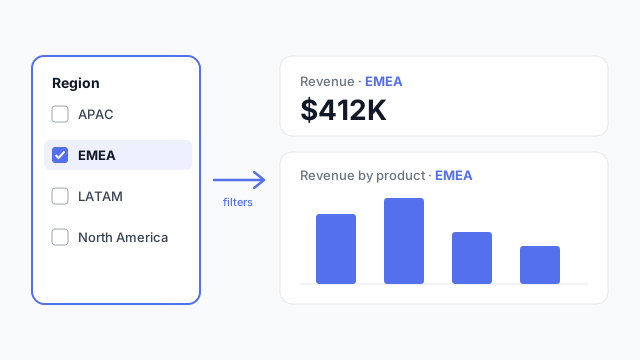
A Region slicer with EMEA selected, filtering the KPI card and bar chart beside it so both show EMEA only.

How it looks in each tool

Same idea, different name. Here's the slicer (or its equivalent) in each BI tool.

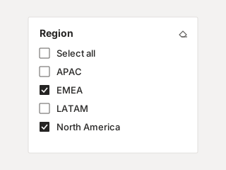
Power BI list slicer titled Region with checkboxes for Select all, APAC, EMEA, LATAM and North America; EMEA and North America are selected.
Power BI Slicer List style with checkboxes. Also comes as a dropdown, tiles, or a date range.
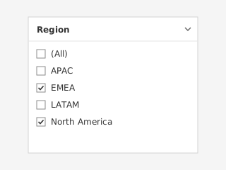
Tableau multiple-values filter card titled Region with an (All) option and checkboxes; EMEA and North America are checked.
Tableau Filter card (quick filter) Shown from a worksheet's filter. Starts with an “(All)” option.
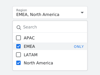
Looker Studio drop-down list control for Region, opened to show a search box and checkboxes; EMEA and North America are checked, with an ONLY link on hover.
Looker Studio Drop-down list control Has a search box, and an “Only” link to pick a single value.

Illustrations, not screenshots. Product names are trademarks of their owners.

How a slicer works

A slicer is bound to one field, for example Region. When a viewer selects “EMEA”, every visual on the page that uses the same data model re-filters to EMEA. You can also sync slicers across pages, so the selection follows the viewer from page to page.

Common slicer styles:

  • Dropdown: compact, good for long lists.
  • List / tiles: every option visible, good for 2–6 values.
  • Between (range): sliders for dates or numbers.
  • Relative date: “last 30 days”, “this quarter”.

What it’s called in each tool

Power BITableauLooker StudioLooker
NameSlicerFilter card / quick filterControl (e.g. drop-down list)Dashboard filter
Where it livesOn the report canvasOn the dashboard, from a worksheet filterOn the report canvasFilter bar above the dashboard
Applies toVisuals on the page (or synced pages)Worksheets you chooseCharts on the page (or report)Tiles you choose

Where slicers go on a dashboard

Put slicers either in a row under the page title or in a narrow left-hand rail, and keep that placement the same on every page. Readers learn where the controls are and stop hunting for them.

Best practices

  • Limit it to 3–4 slicers per page. More than that usually means the page is trying to answer too many questions.
  • Show the current selection. A title like “Revenue — EMEA, Q3” stops people from misreading a filtered view as the total.
  • Pick sensible defaults. A date slicer that opens on “all time” makes the first view slow and rarely useful.

Mocking up slicers

Slicers take up canvas space that people often forget about. Add them to the wireframe early so the charts are sized for the space that’s really left.
See it in a real layout

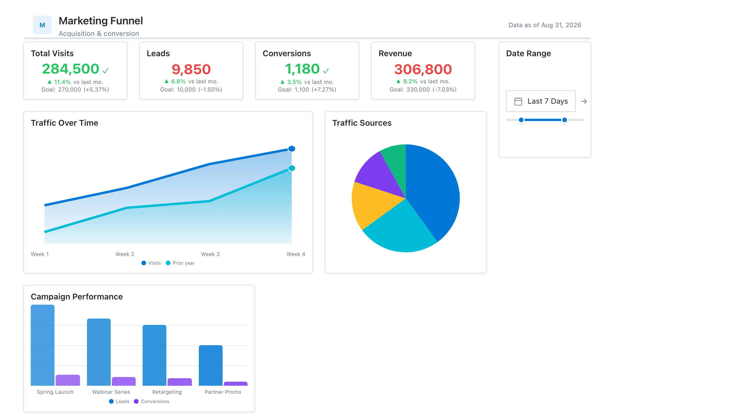
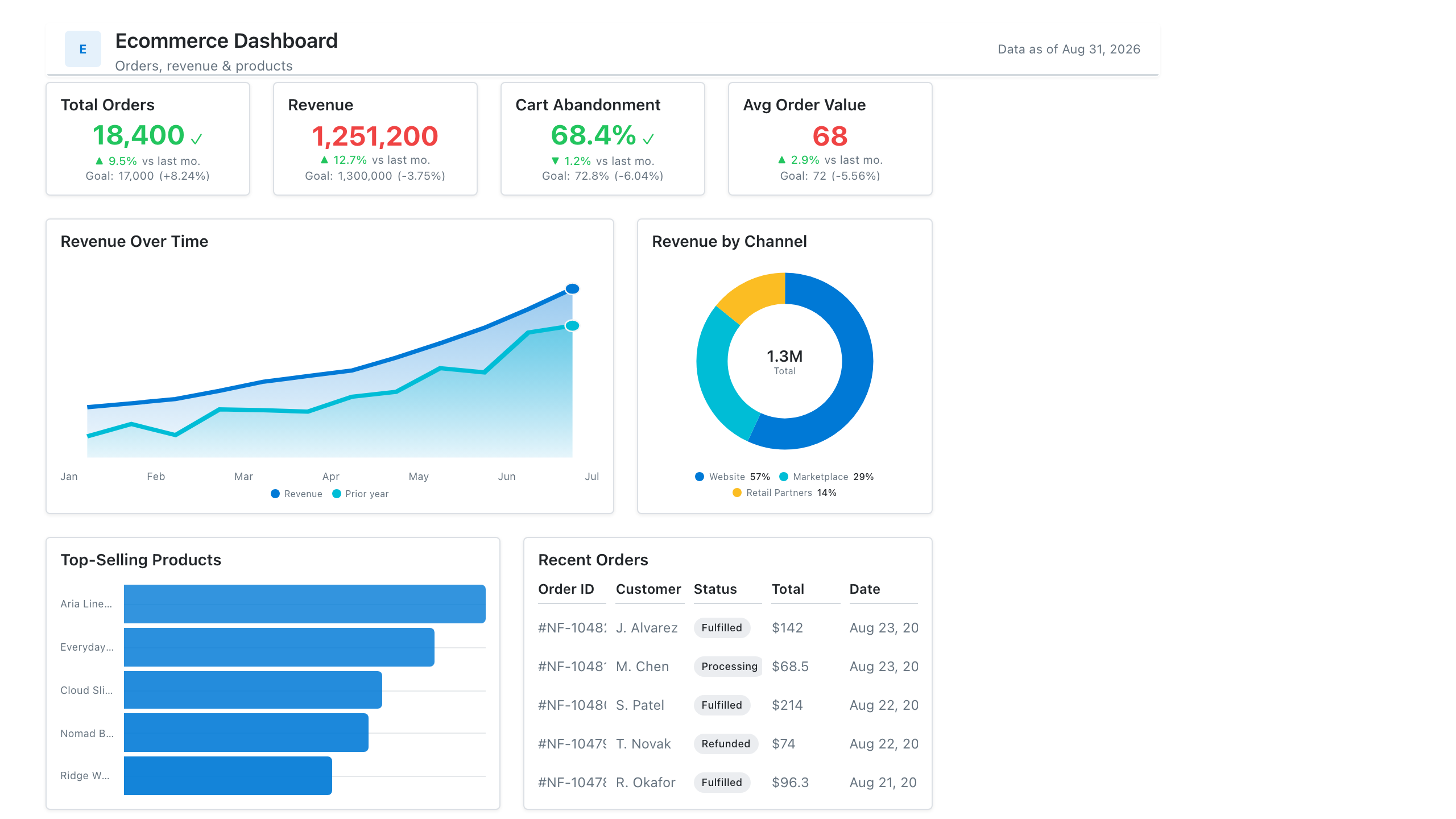
These free Mockko templates use it. Open one and edit it in your browser.

Related terms

Common questions

What's the difference between a slicer and the filter pane in Power BI?
A slicer sits on the report canvas and is part of the design, so viewers always see it. The filter pane is a collapsible side panel. Use slicers for the two or three filters people change all the time, and the filter pane for everything else.
Does Tableau have slicers?
Not by that name. The Tableau equivalent is a quick filter (filter card) or a parameter control shown on the dashboard. They do the same job.
What's the Looker equivalent of a slicer?
In Looker Studio it's a control, most often the drop-down list control, placed on the report canvas. In Looker (the enterprise product), dashboard filters sit in a filter bar across the top of the dashboard instead of on the canvas.

Mock it up before you build it

Lay out your Power BI or Tableau dashboard in Mockko, get sign-off, then build. Free to start.

Try Mockko free