Dashboard Wireframe
Also called: Dashboard sketch, Low-fi dashboard layout
A dashboard wireframe is a low-fidelity sketch of a dashboard's layout, using boxes and labels to show what goes where before any data, colours, or real charts are added.
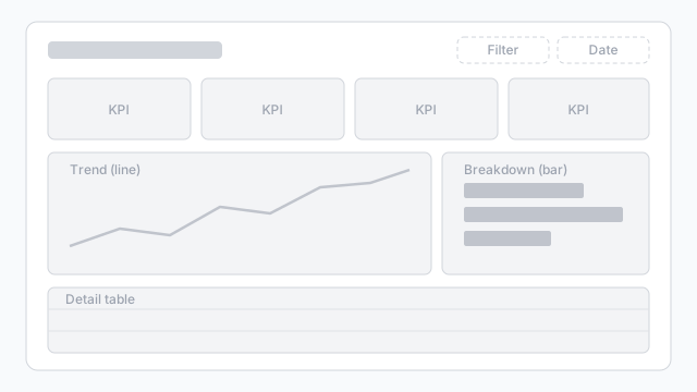
Also called: Dashboard sketch, Low-fi dashboard layout
A dashboard wireframe is a low-fidelity sketch of a dashboard's layout, using boxes and labels to show what goes where before any data, colours, or real charts are added.
A wireframe is for agreeing on structure before anyone argues about colours:
Because it’s just boxes, it’s cheap to change. Moving a chart takes seconds, not a rebuild.
The example above follows the pattern most business dashboards use:
For more on layout, see dashboard wireframe best practices.
Once the layout is agreed, swap the grey boxes for real chart types and sample data to turn it into a mockup that stakeholders can sign off on.
These free Mockko templates use it. Open one and edit it in your browser.
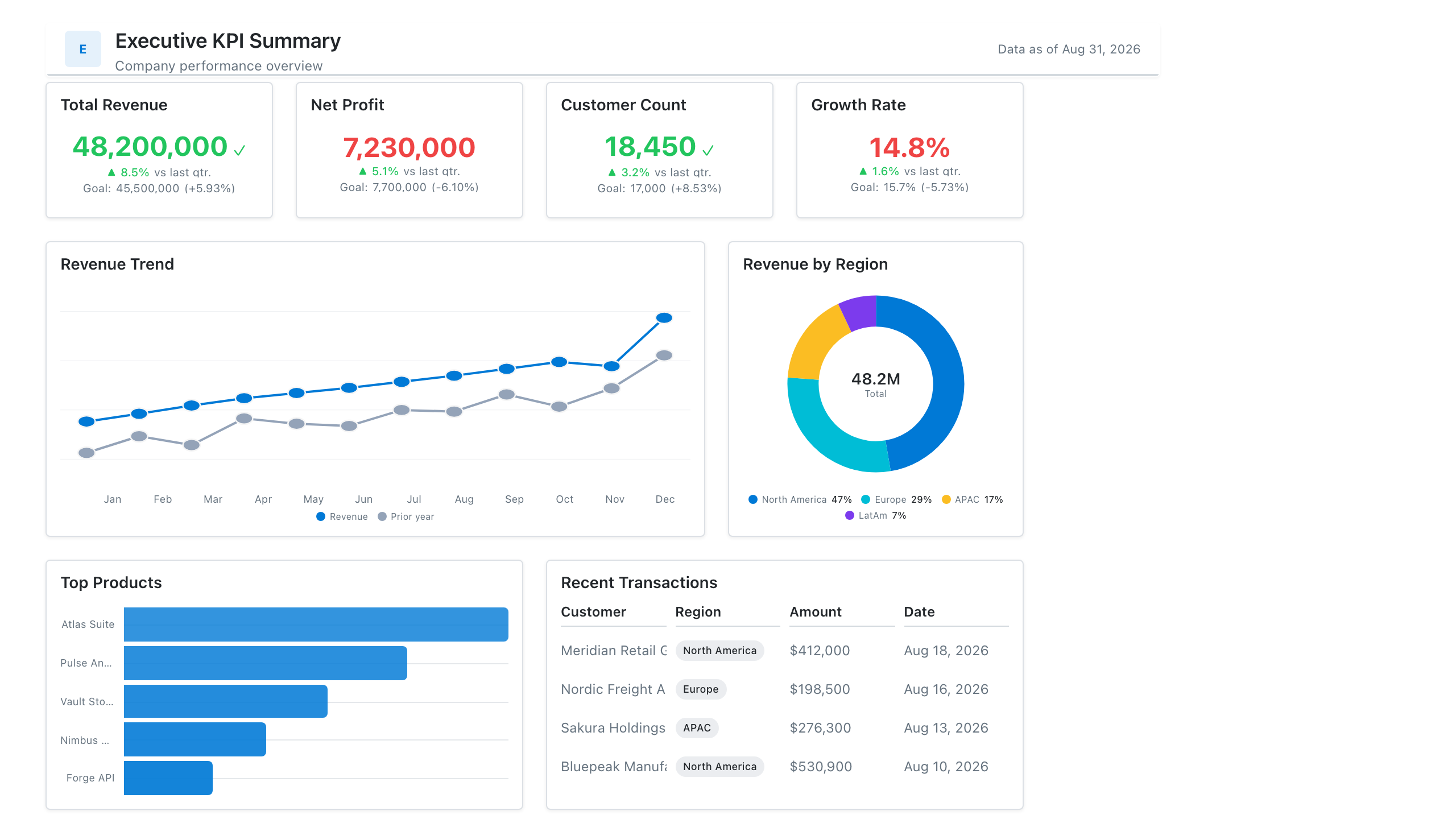
Single-page executive view of the metrics leadership cares about — built for the first client meeting.
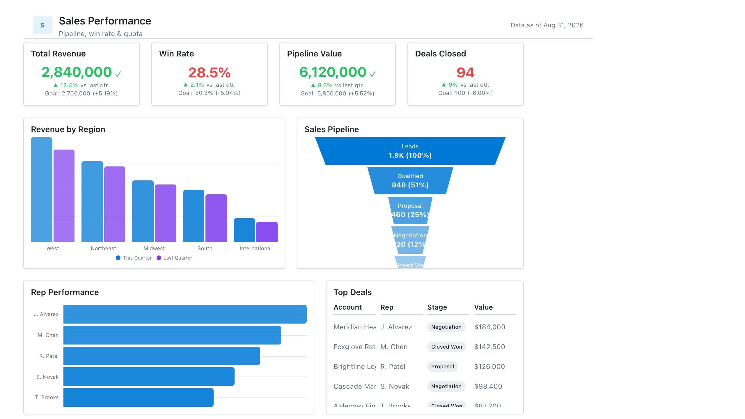
Revenue, win rate, pipeline value, and rep performance across regions — the layout most sales teams build first.
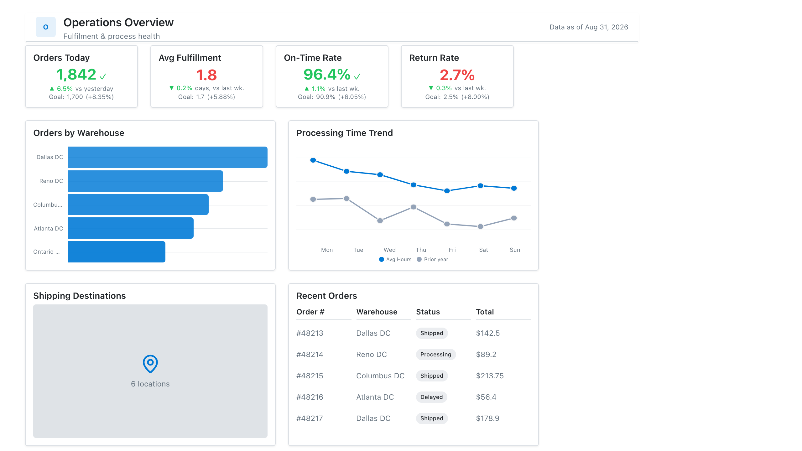
Throughput, SLA attainment, backlog, and process-cycle time for an operational reporting layout leadership can scan at a glance.
Lay out your Power BI or Tableau dashboard in Mockko, get sign-off, then build. Free to start.
Try Mockko free