The short version
In everyday speech, “dashboard” means any page of charts. In Power BI, it’s a specific object, and most of what people call a “Power BI dashboard” is actually a report.
| Report | Dashboard |
|---|
| Pages | One or many | Exactly one |
| Where it’s built | Power BI Desktop or the service | Power BI service only |
| Data | One semantic model | Tiles from one or more reports |
| Interactivity | Slicers, cross-filtering, drill-down | Click a tile to open its source report |
| Filters | Slicers and the filter pane | None on the dashboard itself |
How pinning works
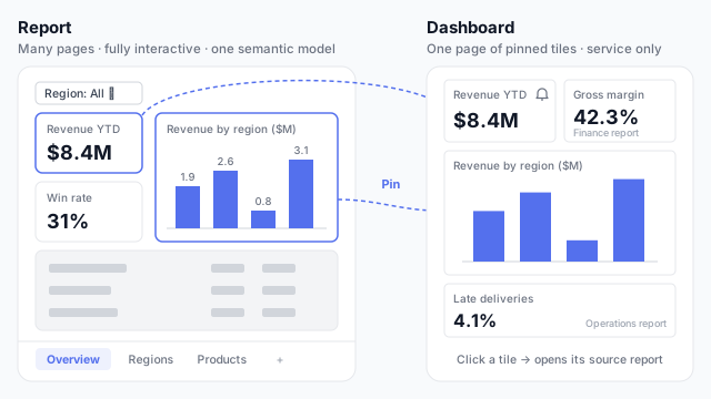
A dashboard doesn’t have its own visuals. You open a published report in the Power BI service, hover over a visual, and pin it to a new or existing dashboard. The tile keeps the filters and slicer selections that were active when you pinned it.
In the example, the Revenue YTD card and the Revenue by region chart are pinned from a sales report. The same dashboard also holds a Gross margin tile from a finance report and a Late deliveries tile from an operations report. That ability to combine sources on one screen is the main reason to build a dashboard.
You can also pin a whole report page as a live tile, which keeps the page interactive inside the dashboard.
When to use each
Use a report for almost everything: exploring data, answering questions, and giving people pages they can filter. Reports are where the design work goes, from layout to KPI cards and slicers.
Add a dashboard when:
- Leaders want one screen across several reports, such as sales, finance and operations together.
- You want data alerts on a few key numbers. Dashboard tiles showing a card, KPI or gauge can notify owners when a threshold is crossed.
- People need a landing page that points into the detailed reports.
If none of those apply, skip the dashboard. A well-designed first report page usually does the same job with less to maintain.
Common mistakes
- Designing the dashboard first. Dashboards are assembled from report visuals, so the report layout is what needs designing.
- Expecting slicers to carry over. A pinned tile won’t respond to a slicer on the report. It shows whatever was selected at pin time.
- Rebuilding the report as a dashboard. A dashboard of twenty tiles from one report adds a click and a maintenance job, and nothing else.
Mocking up a Power BI report
Since the report is where the real layout lives, that’s what to mock up: pages, visuals and slicers. Our guide to mocking up a Power BI dashboard before you build it walks through it.