The difference in one example
The same data, late deliveries, can drive two very different dashboards.
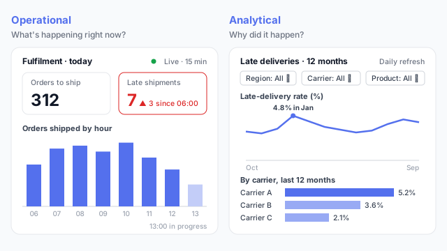
The operational version is for the warehouse shift lead. It shows today: 312 orders still to ship, 7 late shipments (3 more since 06:00), and orders shipped by hour. It refreshes every few minutes and needs no clicks, because its job is to prompt action before the carrier pickup.
The analytical version is for the operations analyst. It shows twelve months of late-delivery rate, peaking at 4.8% in January, with filters for region, carrier and product, and a breakdown showing Carrier A well above the others. Its job is to explain why and to support a decision, such as renegotiating a carrier contract.
The three main types
Most dashboards fit one of three types. Knowing which one you’re building settles a lot of design questions early.
Strategic: “Are we on track?”
- Audience: leadership
- Time frame and refresh: quarter or year to date, refreshed daily or weekly
- Interaction: almost none
- Typical visuals: KPI cards, trend vs. target
Operational: “What’s happening now?”
- Audience: front-line managers and shift leads
- Time frame and refresh: today or this shift, refreshed live to hourly
- Interaction: alerts, few clicks
- Typical visuals: big numbers, status lights, hourly bars
Analytical: “Why did it happen?”
- Audience: analysts, finance and planners
- Time frame and refresh: months or years of history, refreshed daily
- Interaction: filters, drill-downs, detail pages
- Typical visuals: line charts, breakdowns, matrices
An executive dashboard is the classic strategic dashboard. A KPI dashboard can sit on either side, depending on how often its numbers change and who acts on them.
How the type changes the design
- Operational dashboards put the few numbers that trigger action in large type at the top, with thresholds shown in colour. Screens are often wall-mounted or on a tablet, so text must be readable from a distance and there’s no hover.
- Analytical dashboards are denser. They carry slicers or filters, several related charts, and a table or matrix of detail. Readers are expected to click around.
- Strategic dashboards sit in between: few metrics, always against a target, with enough context to show direction.
In Power BI, the word “dashboard” also has a narrower meaning: a single page of pinned tiles in the Power BI service. See report vs. dashboard.
Common mistakes
- Building for everyone. One page trying to serve the CEO, the shift lead and the analyst ends up serving none of them.
- Filters on an operational screen. If the shift lead has to pick today’s date and their site every morning, they’ll stop looking.
- Live refresh on analytical pages. Numbers that change mid-analysis cause more confusion than insight.
Mocking up by dashboard type
Decide the type before you wireframe the dashboard, because it drives the layout, refresh and interactivity. A quick mockup for each audience, as in what is a mockup, shows early whether one page is really two.