Combo Chart
Also called: Line and column chart, Dual-axis chart, Bar-line chart
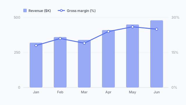
A combo chart combines columns and a line in one visual, usually on two y-axes, to compare a volume (like revenue) with a rate (like margin) over the same time period.
Also called: Line and column chart, Dual-axis chart, Bar-line chart
A combo chart combines columns and a line in one visual, usually on two y-axes, to compare a volume (like revenue) with a rate (like margin) over the same time period.
Use a combo when two measures share a time axis but have different units or scales, and the relationship between them is the point:
Columns usually show the volume and the line shows the rate.
Stakeholders often ask for “revenue and margin on one chart”. Mock it up with realistic numbers first. Sometimes two small charts stacked on top of each other read more clearly, and it’s much easier to find that out on a mockup.
These free Mockko templates use it. Open one and edit it in your browser.
Lay out your Power BI or Tableau dashboard in Mockko, get sign-off, then build. Free to start.
Try Mockko free