Funnel Chart
Also called: Conversion funnel, Sales funnel chart
A funnel chart shows how many people or items make it through each stage of a process, such as visit → sign-up → purchase, with each stage narrower than the last.
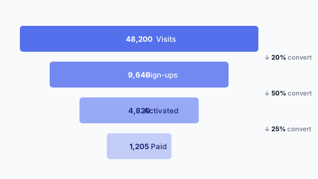
Also called: Conversion funnel, Sales funnel chart
A funnel chart shows how many people or items make it through each stage of a process, such as visit → sign-up → purchase, with each stage narrower than the last.
Each bar is a stage, top to bottom in process order. The bar’s width is the count at that stage. The useful number is usually the drop between stages, the conversion rate, so good funnels label it directly instead of making readers do the maths.
In the example above, the biggest leak is visit → sign-up (only 20% convert), so that’s where to look first.
Stage definitions (“what counts as activated?”) cause most funnel arguments. Put the stage names on the mockup and get sign-off on them before anyone builds the logic.
These free Mockko templates use it. Open one and edit it in your browser.
Lay out your Power BI or Tableau dashboard in Mockko, get sign-off, then build. Free to start.
Try Mockko free