Donut Chart
Also called: Doughnut chart, Ring chart
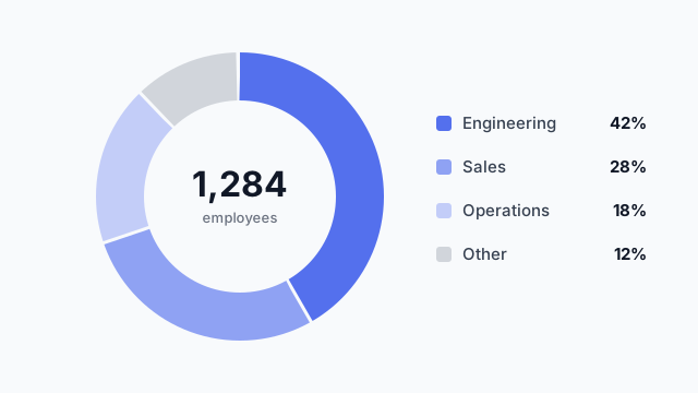
A donut chart is a pie chart with the centre cut out. It shows how a whole splits into parts, and the empty centre is often used for the total.
Also called: Doughnut chart, Ring chart
A donut chart is a pie chart with the centre cut out. It shows how a whole splits into parts, and the empty centre is often used for the total.
Use a donut when the question is “what share of the total is each part?” and there are only a few parts. Headcount by department, traffic by channel and revenue by product line all work.
Don’t use one to compare values across time or across many categories. People are bad at comparing angles, and a bar chart does both of those jobs better.
A donut needs roughly square space, which can be awkward in a wide dashboard row. Place it in the mockup early and check it doesn’t leave dead space, or pair it with its legend on the right as in the example.
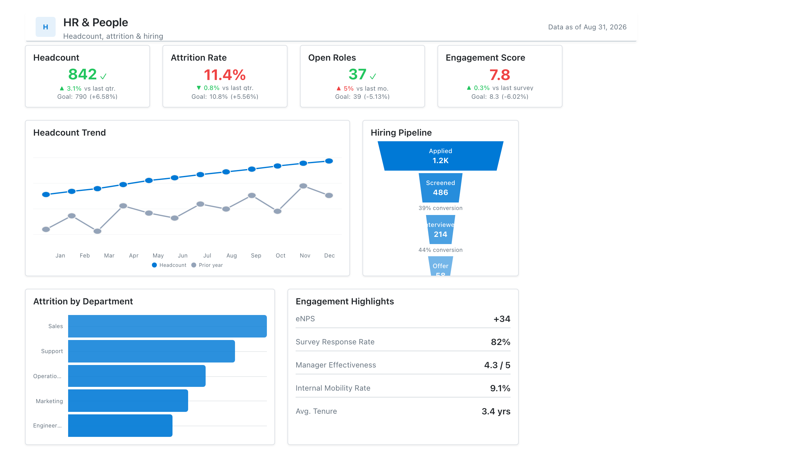
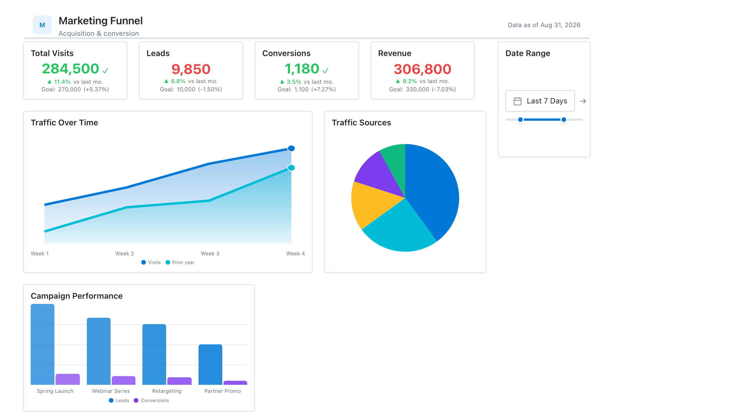
These free Mockko templates use it. Open one and edit it in your browser.
Lay out your Power BI or Tableau dashboard in Mockko, get sign-off, then build. Free to start.
Try Mockko free