What an executive dashboard is for
Leaders don’t have time to read charts. They want to know three things: are we on track, where aren’t we, and what do I need to decide? An executive dashboard answers those on one screen, with no scrolling and no filters to set first.
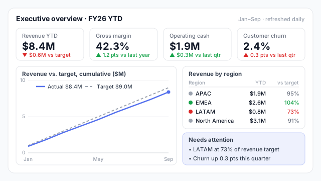
In the example, the answers are clear in a few seconds. Revenue is $0.6M behind target YTD. The gap comes mainly from LATAM, at 73% of target. And churn has ticked up, which is worth a question even though margin and cash look healthy.
How it’s structured
Most good executive dashboards follow the same three layers, top to bottom:
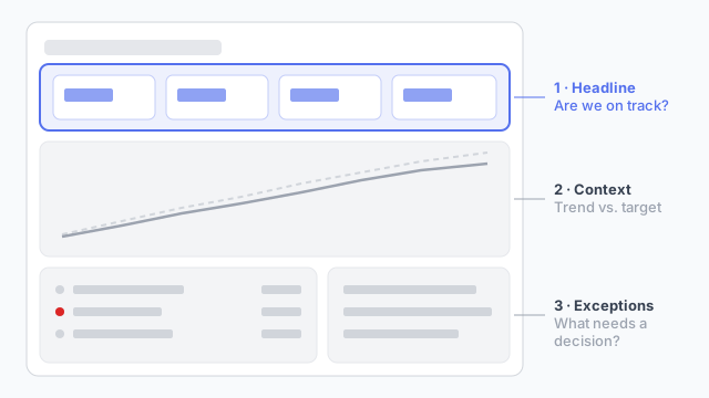
- Headline. Four to six KPI cards, each with a comparison to target or last period. Colour follows meaning, so churn going up is red.
- Context. One trend against target, often cumulative for the year, so a bad month doesn’t look like a crisis and a good one doesn’t hide a slide.
- Exceptions. A short status list (by region, business unit or product line) and a few written callouts. This is the part that turns the page into a meeting agenda.
What makes it different from other dashboards
| Executive | Team / operational |
|---|
| Audience | CEO, leadership team, board | Managers and analysts |
| Scope | Whole business, few metrics | One team or process, many metrics |
| Question | ”Are we on track?" | "What’s happening, and why?” |
| Refresh | Daily or weekly | Often hourly or live |
| Interaction | Minimal | Filters, drill-downs, detail pages |
See operational vs. analytical dashboards for the wider picture.
Best practices
- Agree the metric list before the design. The hardest part is getting leadership to pick six metrics, not ten. Settle that first.
- Show every number against something. A target, budget or last year. A number on its own tells an executive nothing.
- Write the callouts in plain words. “LATAM at 73% of target” beats a red cell they have to go and find.
- Keep it to one page. If it needs a second page, the second page is a different dashboard for a different audience.
- Round hard. $8.4M, not $8,412,337. Nobody at the top table reads the decimals.
Mocking up an executive dashboard
The metric list and the order of the cards are political decisions as much as design ones, and they’re far cheaper to settle on a mockup before a single measure is built. Our guide to presenting a dashboard mockup to stakeholders covers how to run that conversation.